Posts

Showing posts from May, 2022

Portfolio Credits

Image
Portfolio Credits  

Portfolio Animation

Image
Portfolio Animation  

Portfolio Audio

Image
Portfolio Audio  

Portfolio Autoscopy

Image
Portfolio Autoscopy  

Portfolio SomeWhere

Image
Portfolio SomeWhere  

Portfolio Poster

Image
Portfolio Poster  

Portfolio Calligram

Image
Portfolio Calligram  

Portfolio Business cards

Image
Business Cards  

Portfolio Logos Page 2

Image
Logos Page 2  

Portfolio Page 1

Image
Canvas Page 1  

Portfolio Index

Image
Index  

Portfolio Coverpage

Image
  Portfolio  This is the cover page of the portfolio.

Animation and Soundtrack

Image
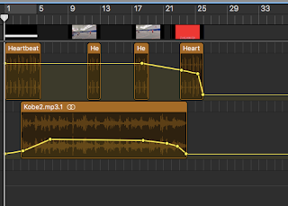
  Animation Soundtrack Animation    For my animation, I chose to animate a video of me shooting a basketball around. In the animation parts of the video, I decided to go with an all-black background and purposely left out the other two guys in order to represent what it feels like when I am in the "zone." When I'm in the "zone" shooting the basketball, I shut off all sound around me and become one with the basket and the ball. The heartbeat symbolizes the only thing that I hear when I'm shooting the ball. I also chose a narration from my basketball idol, the late Kobe Bryant because he has always been an inspiration to me on and off the court. At first, I was thinking about adding the swosh sound of the ball going through the net, but because I wanted to really represent what it feels like to be in the zone, I thought the swosh would interfere with the quietness of the zone. 

Autoscopy 9

Image
Autoscopy Autoscopy For this project, I chose to do something very impactful to me personally. Had a really hard time making this because it really hit hard in terms of my emotions. The message of this is how growing up, my dad always told me to never be emotional as a man. Always would call me names and whatnot if I was showing any type of sadness or in this case, "weakness." I grew up playing sports and with that came a lot of pressure to not show any emotion because sports comes with emotion. As time went on I learned how to keep my emotions to myself and suppress them. I was really losing myself and became very dark and cloudy hence why I made my image dark and cloudy looking. In my actual image, I actually have a black eye from an altercation that I won't get into here but this project was really hard to make for myself. 

Autoscopy JPG's

Image
 

Autoscopy Gifs

Image

Somewhere 7

Image
Somewhere 7 Somewhere 7   For this project, I used a scene from one of my favorite movies: The Hangover Part II. I used a picture of me that was taken at a bar in Clearwater and when looking at it, I thought to myself that this can work well with this scene. The whole point of me looking not beat up and dirty like the characters in the scene was to show how I know how to handle myself when going out and they cannot. That's why I am looking over at the two characters on my left thinking to myself, "damn they really cannot hang with me." Overall, the whole point of this project was to play the game and really fit the scene and I did not do that well. Also, my picture is a little blurry, and could've taken or used a better one for sure. 

B&W to Color 6

Image
  B&W to Color     B&W to Color    B&W to Color    B&W to Color    This was an interesting project, to say the least. I used a lot of bright and crazy colors to make myself look really scary. I did have fun with this one because of how free we are with how we could make ourselves look. The biggest issue I had with this project, was the outlining part of it. Also could have used more time in getting those outlines to look good rather than having pointy jagged edges along with the picture. 

Poster 5

Image
  Poster 5 Poster 5 For the poster project, I decided to use all variations of the color green because it is my favorite color and I also do care about the environment. These two go hand-in-hand and are put together to create a go-green poster. This is one of my better projects but still could have been better. Could have used a little more time on this one to make it a hall of fame project. 

Calligram 4

Image
  Calligram 4 Calligram 4 For the calligram project, I decided to use one of my favorite pictures I have of myself from prom and then combined a lot of words and thoughts that I have to re-create the image. Was told it could have been better and I agree. Should have spent more time on this project and it most likely would have turned out a lot better.   

Business Card 3

Image
Business Card 3 Business Card 3   Now putting my logo on a business card was fun. The one I like the best is the black and white one. The blue and gold one I also like, but the black and white just seems more simple and more professional. I also took the liberty of adding a funky-looking shape to my business card. It seemed like a good idea at first, but looking at it now it just feels like it is distracting. 

Logo 2

Image
  Logo 2 So for the logo project, I decided to pick a word that best represents me and I chose the word hyper. I have been told by many people how hyper I am and how hyper I could be sometimes. I do apologize to them but it is who I am so I am not really that sorry. Then I chose the word media to follow up with it because I already help assist a social media account called pigout_nyc on Instagram so I thought it would be fitting. 

Canvas 1

Image
       Canvas 1     For the first project of the year, I did have a lot of trouble understanding HTML coding. This was the image that I tried to code and it did not work out at all. Definitely needed a lot more time with this one. For future reference, if I never ever need to code again, is to make sure to give myself weeks in advance to start the process.